
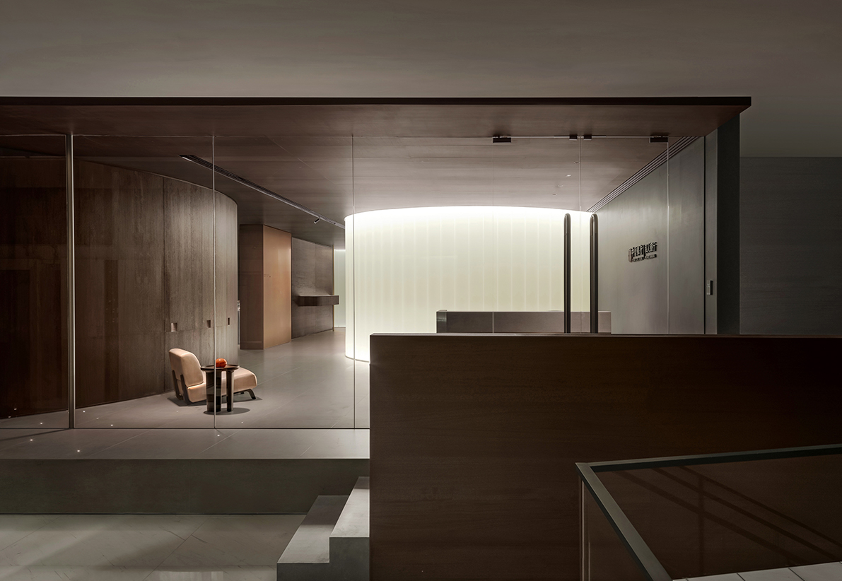
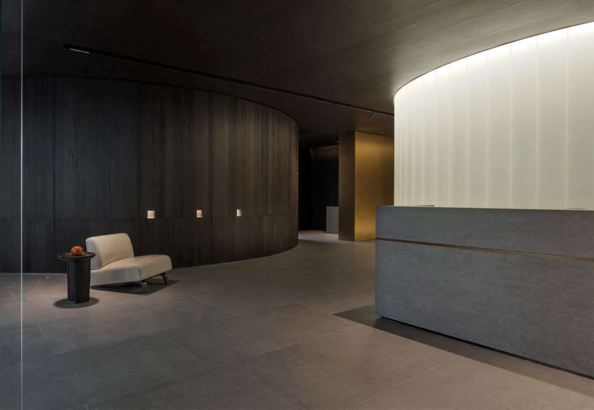
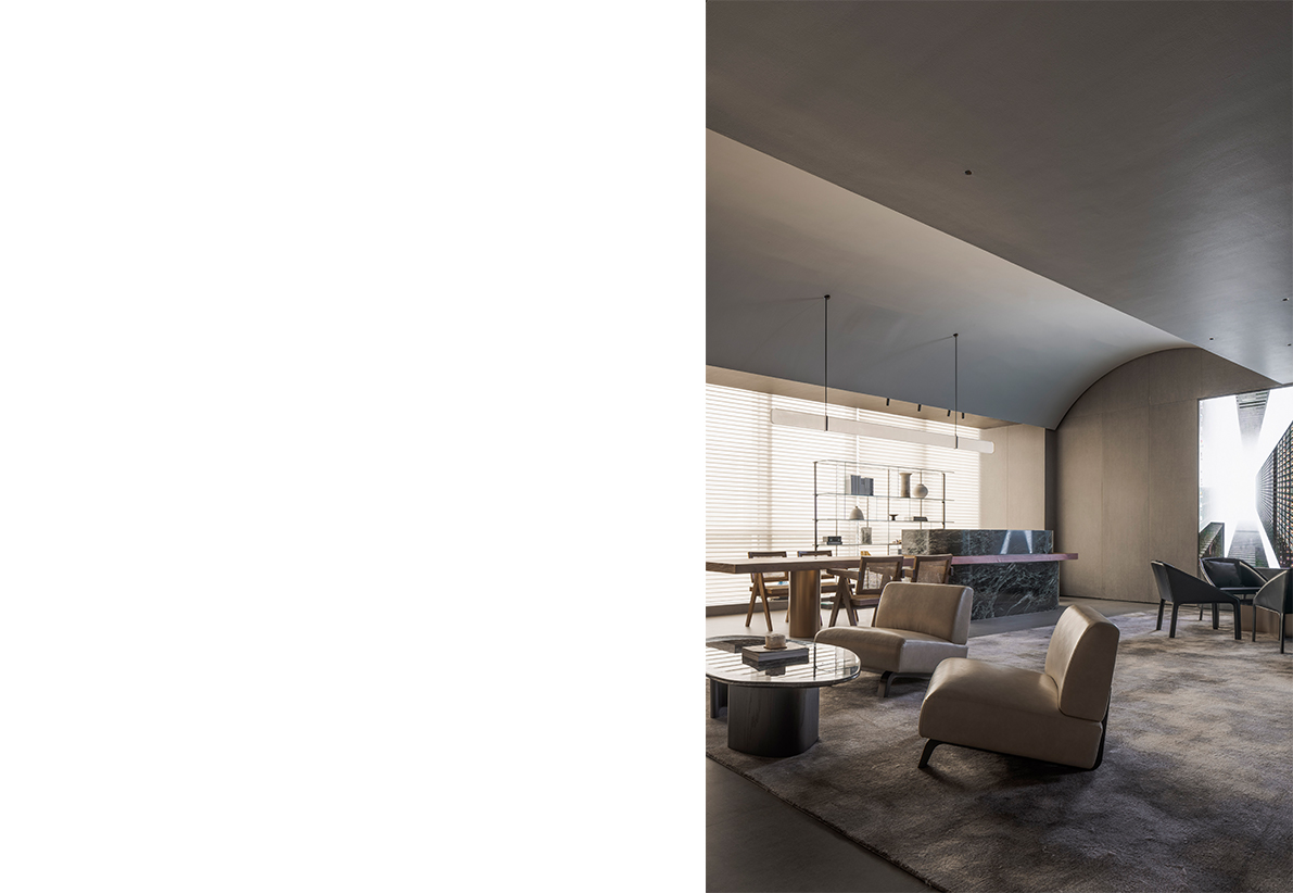
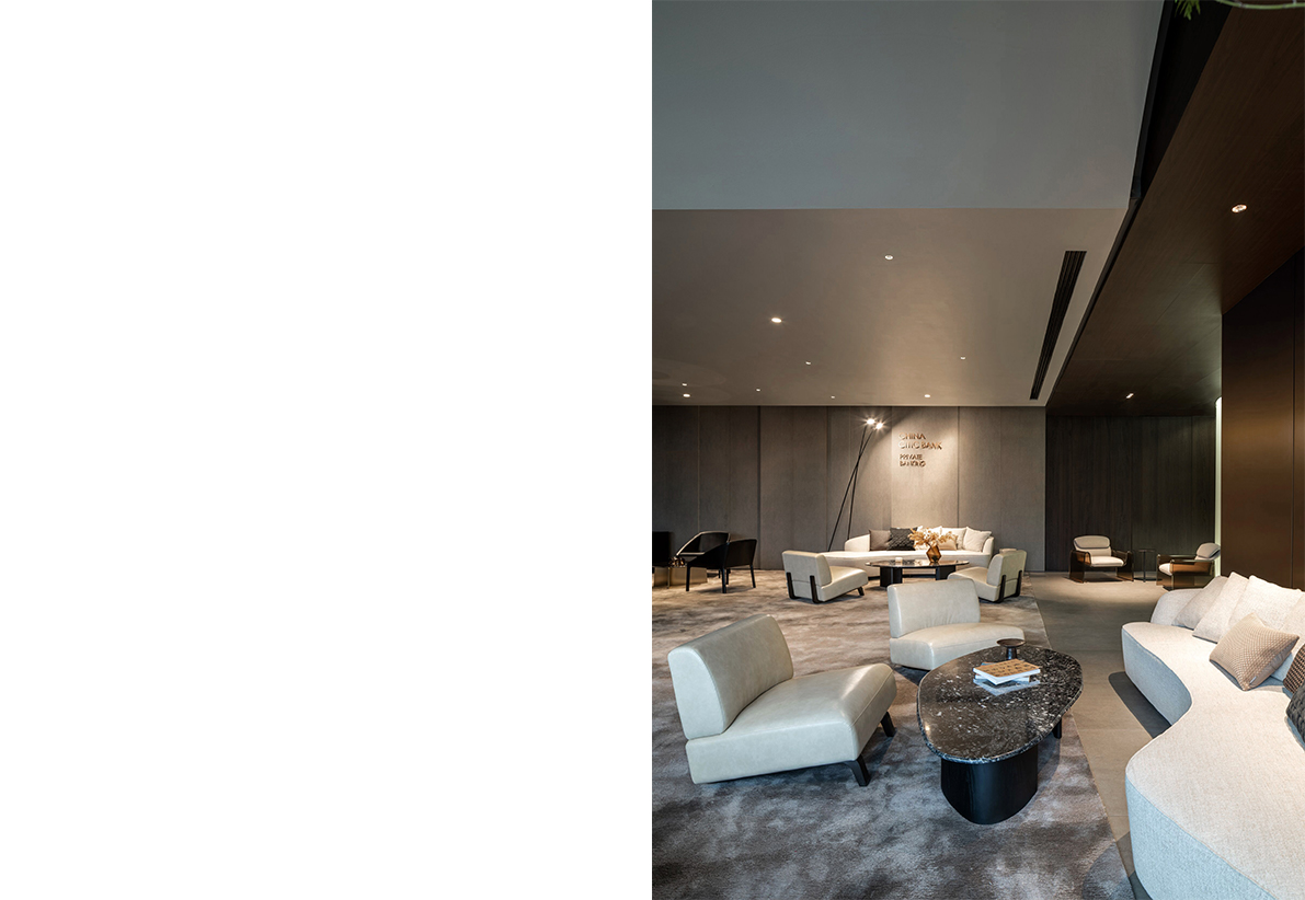
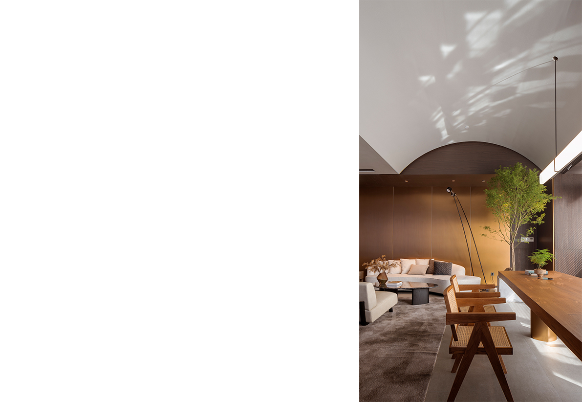
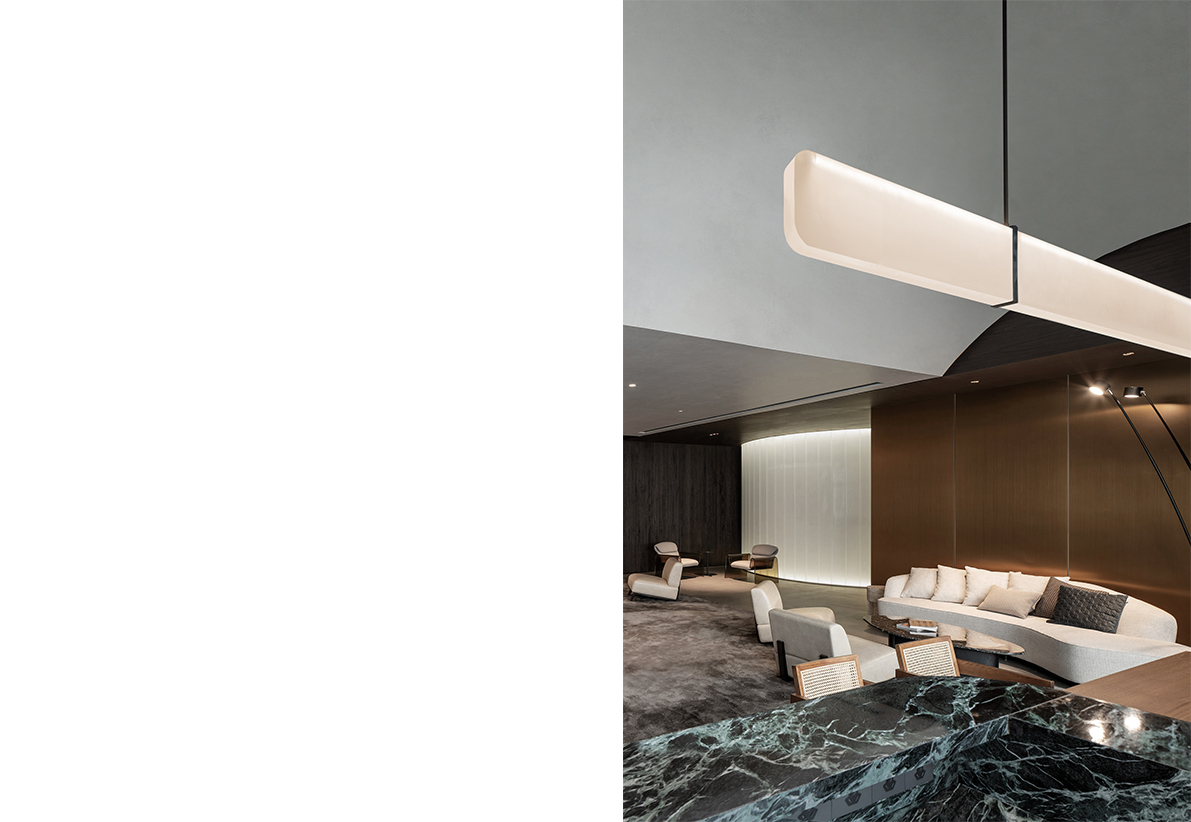
Illuminate C
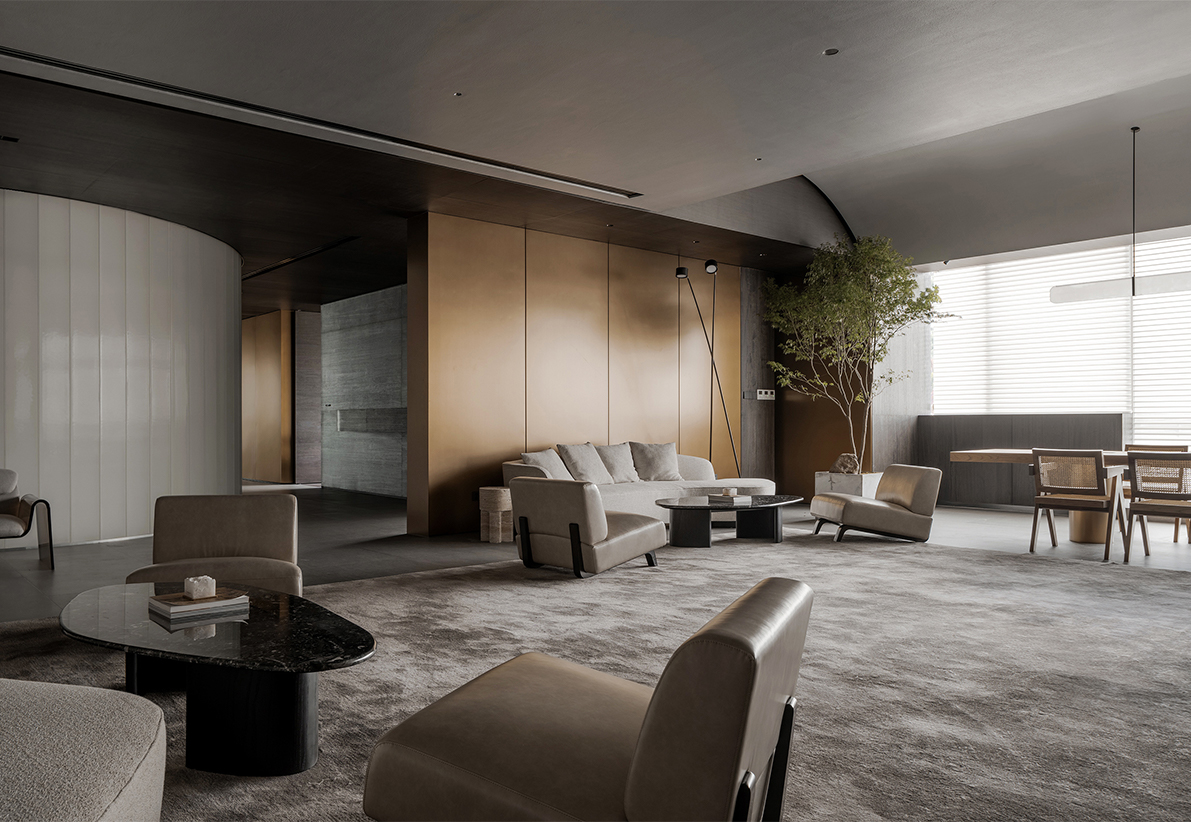
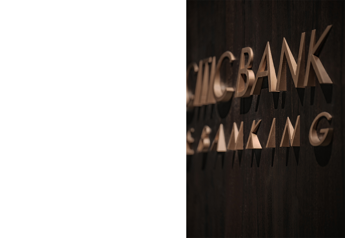
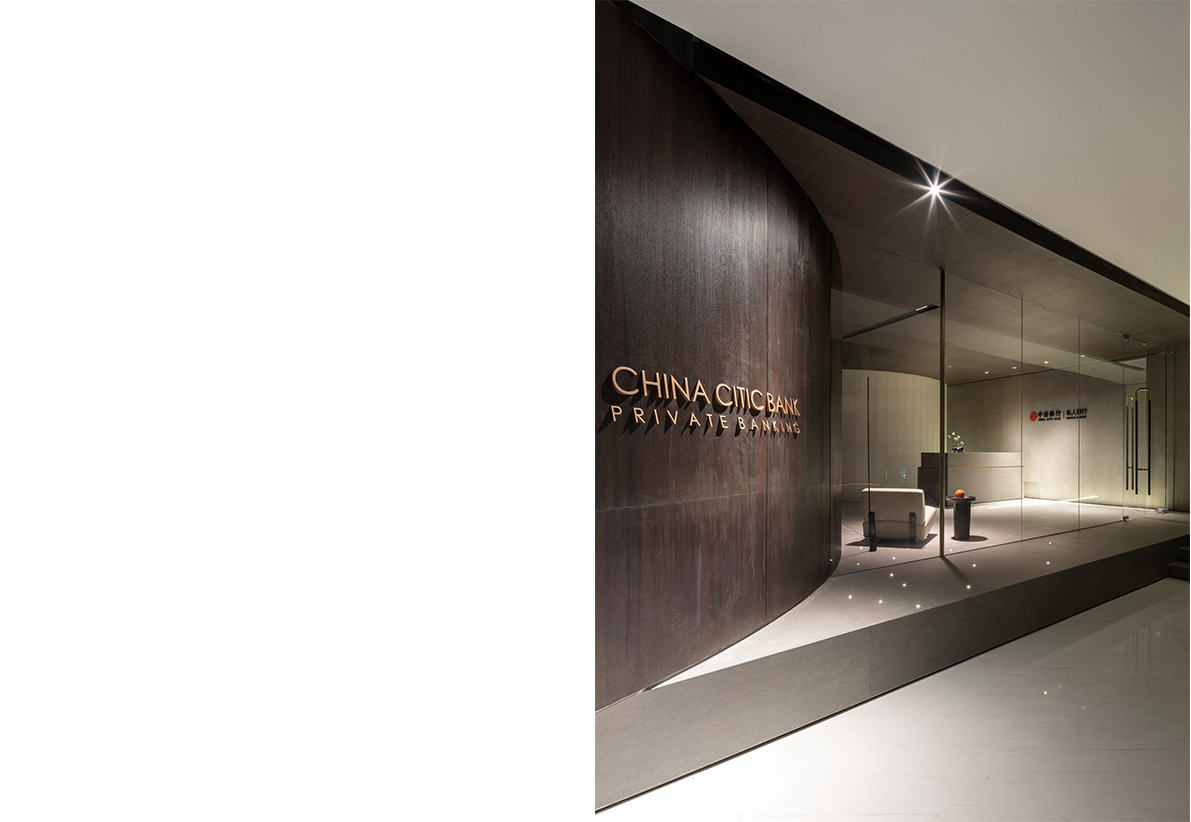
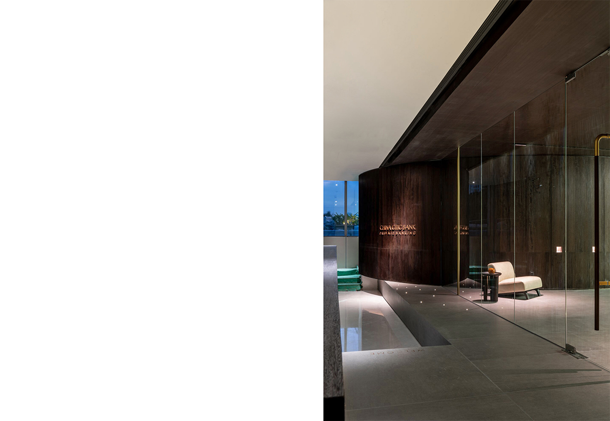
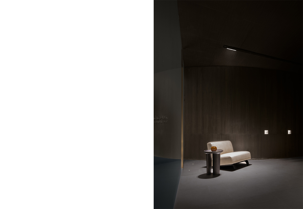
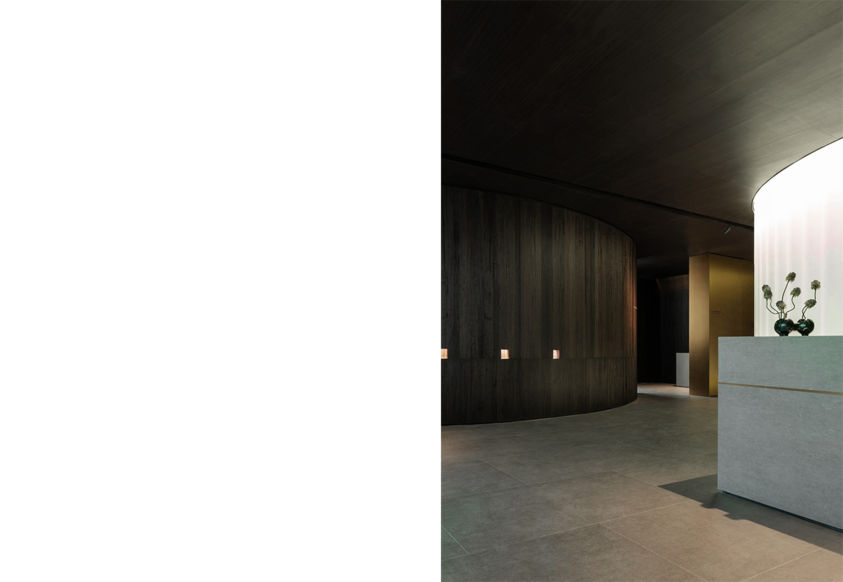
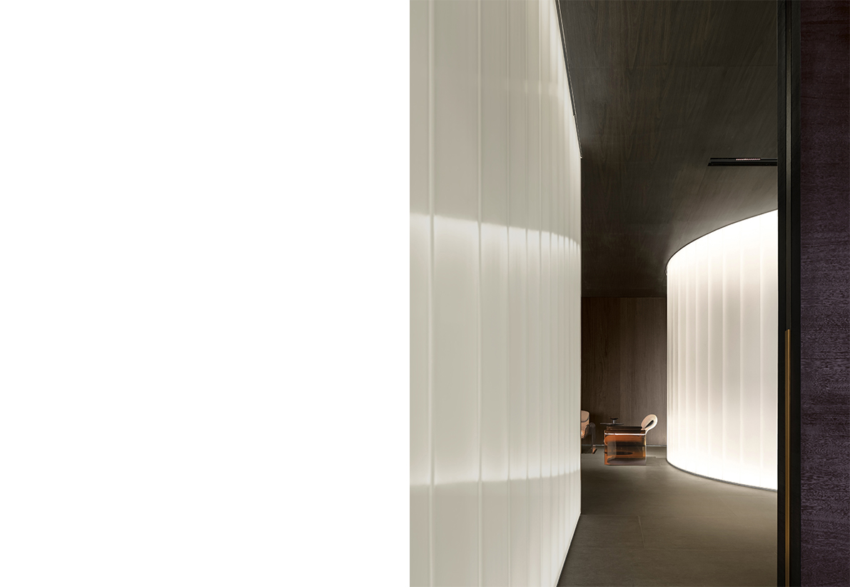
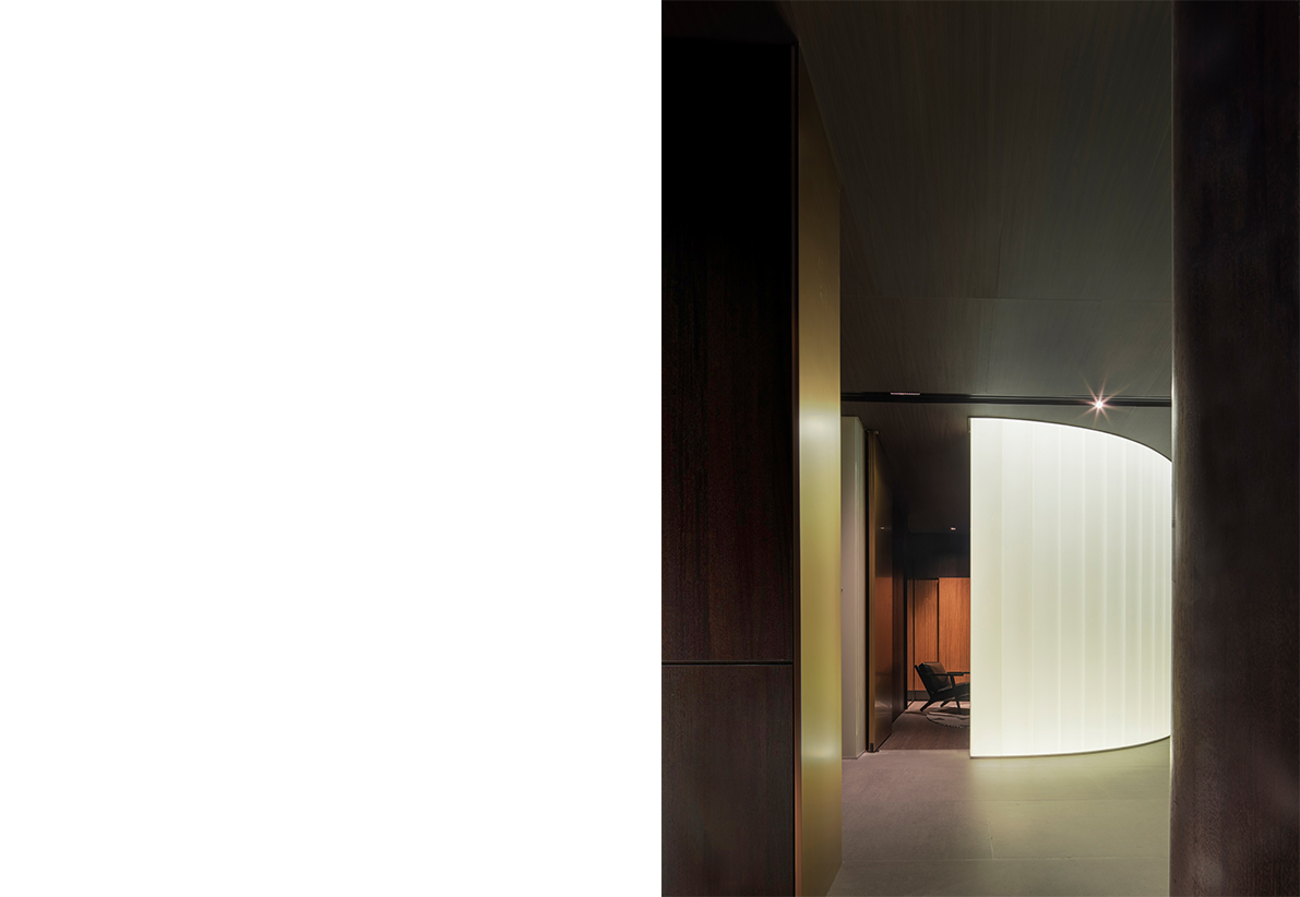
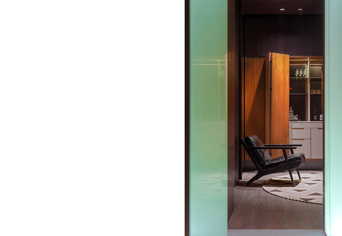
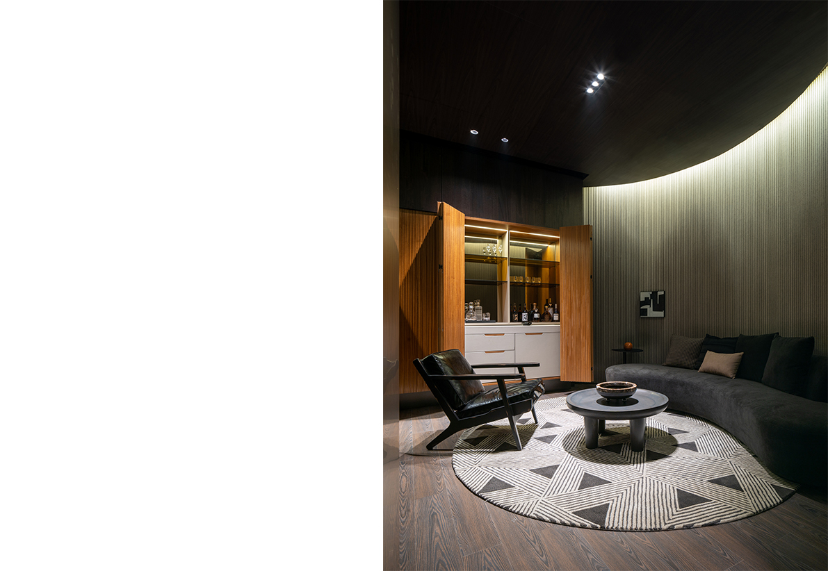
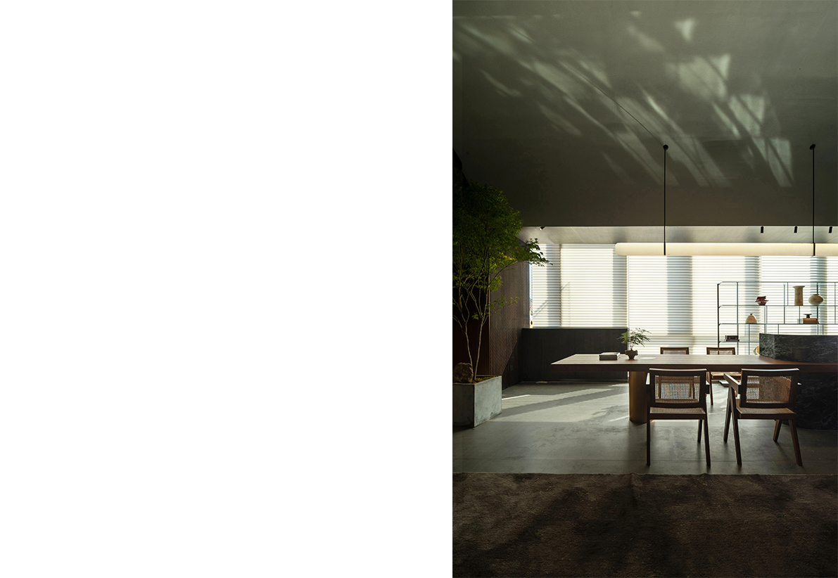
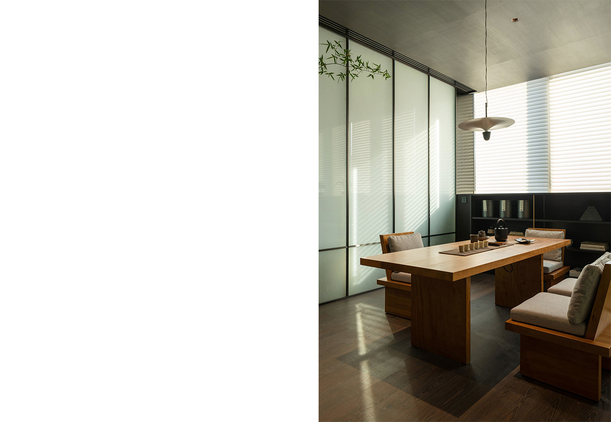
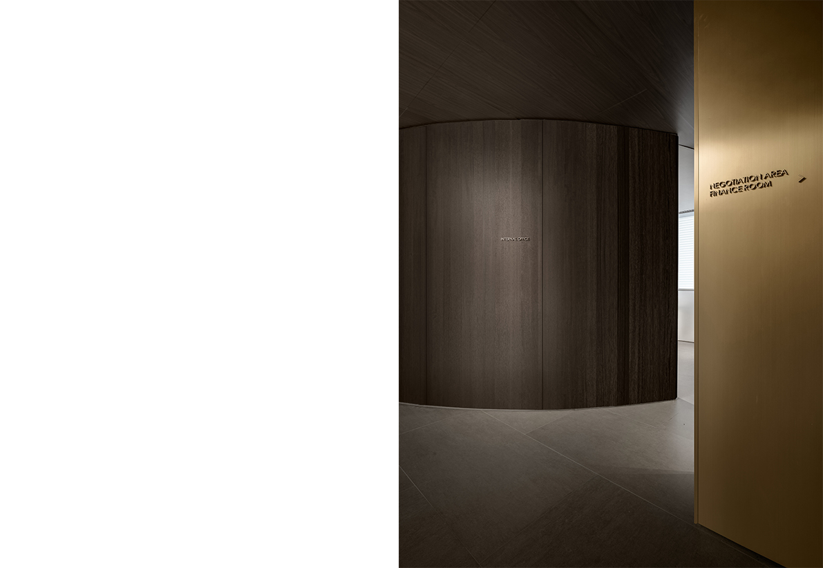
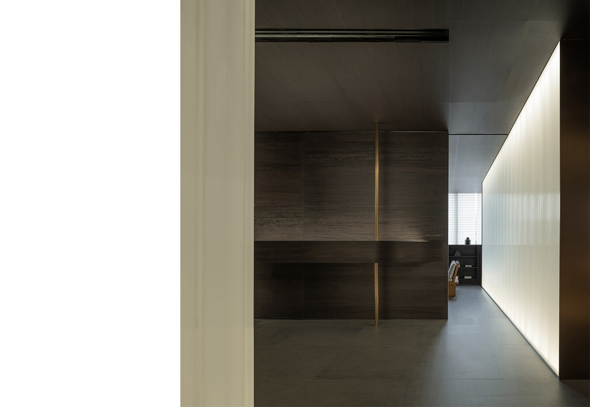
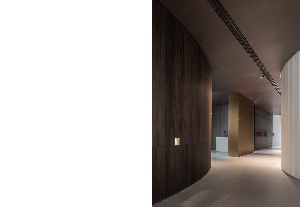
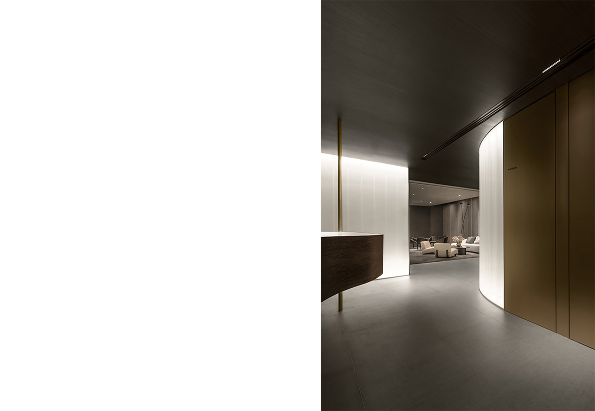
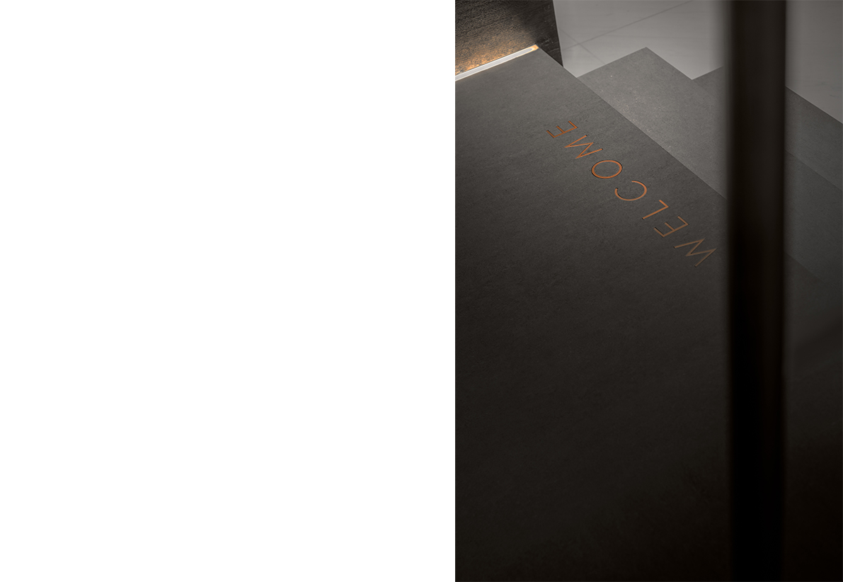
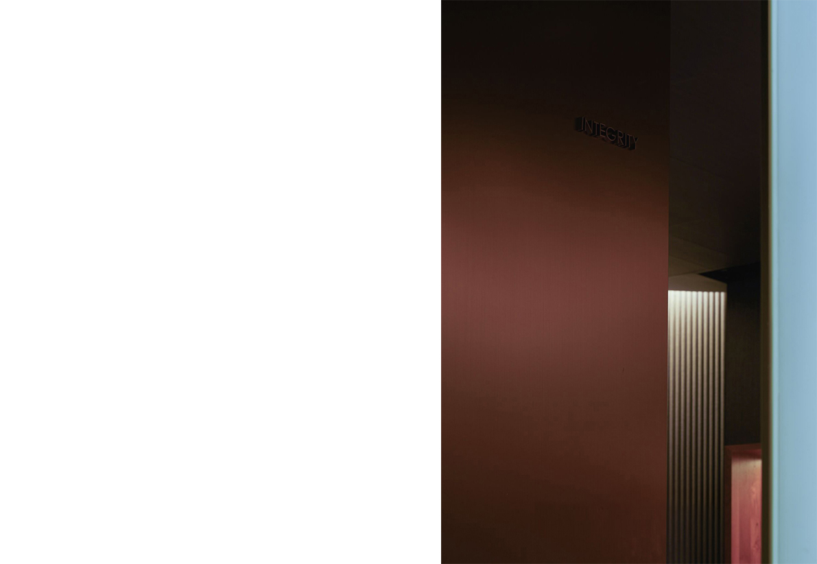
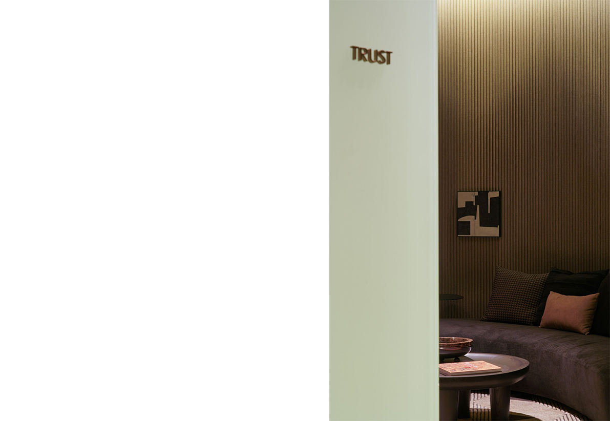
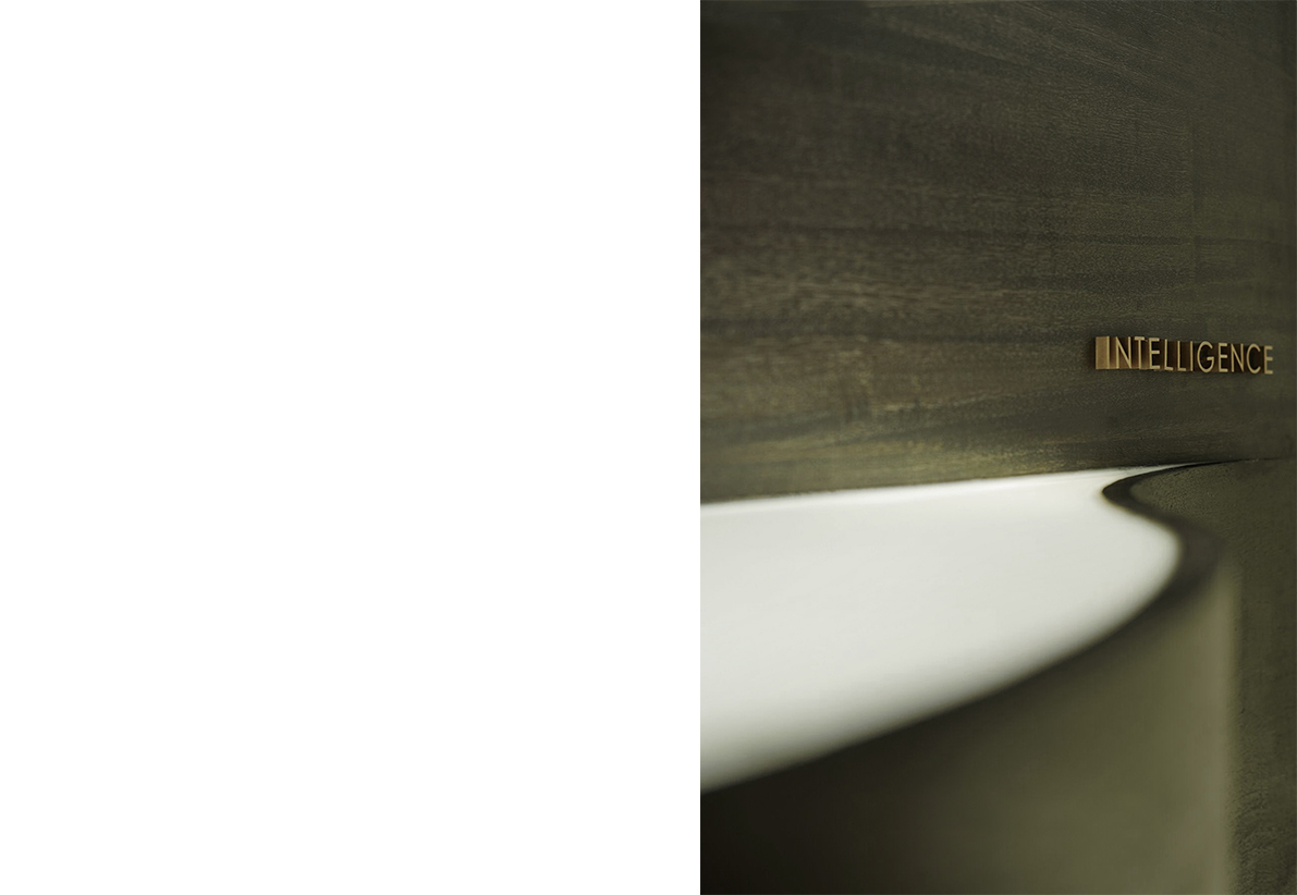
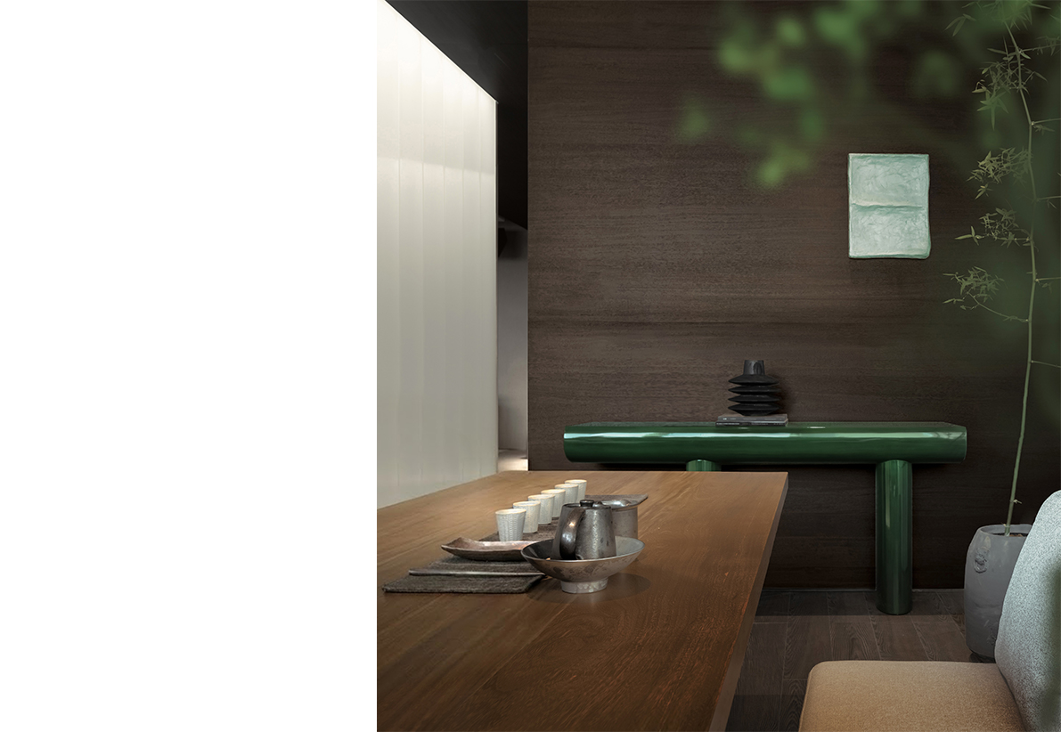
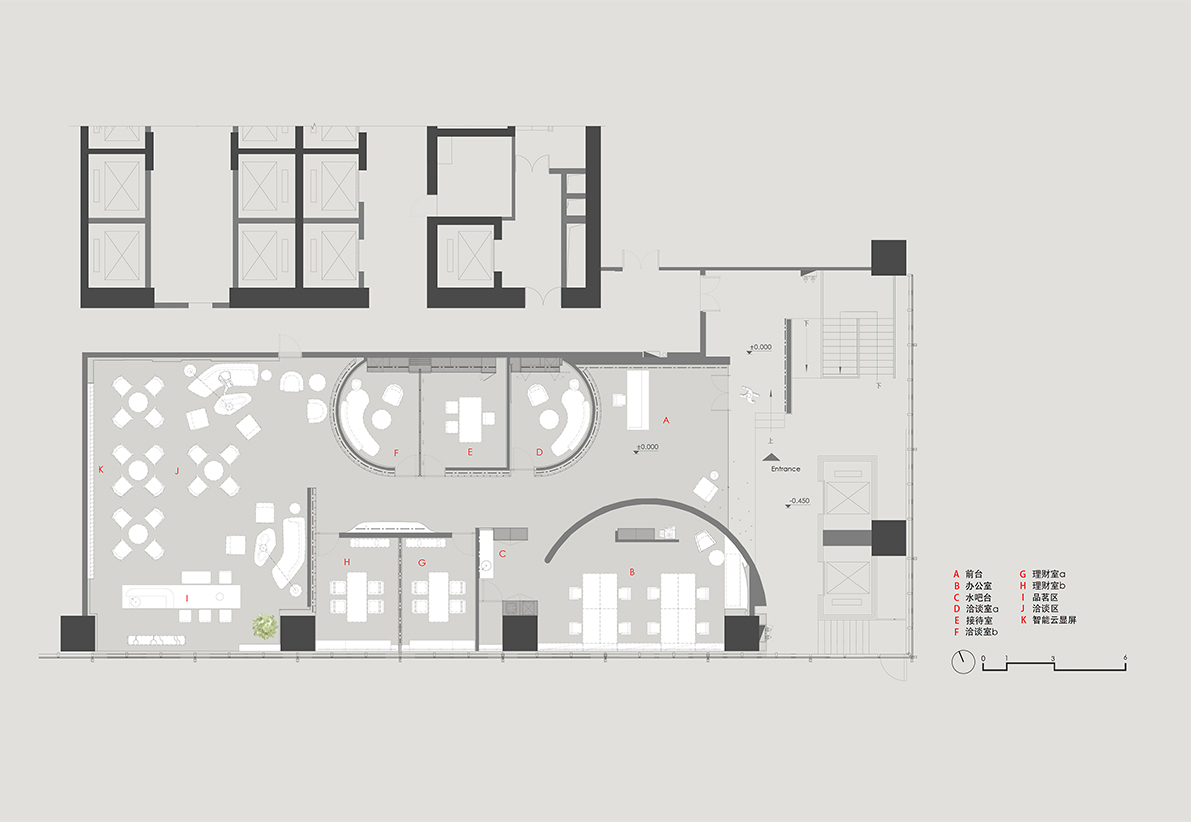
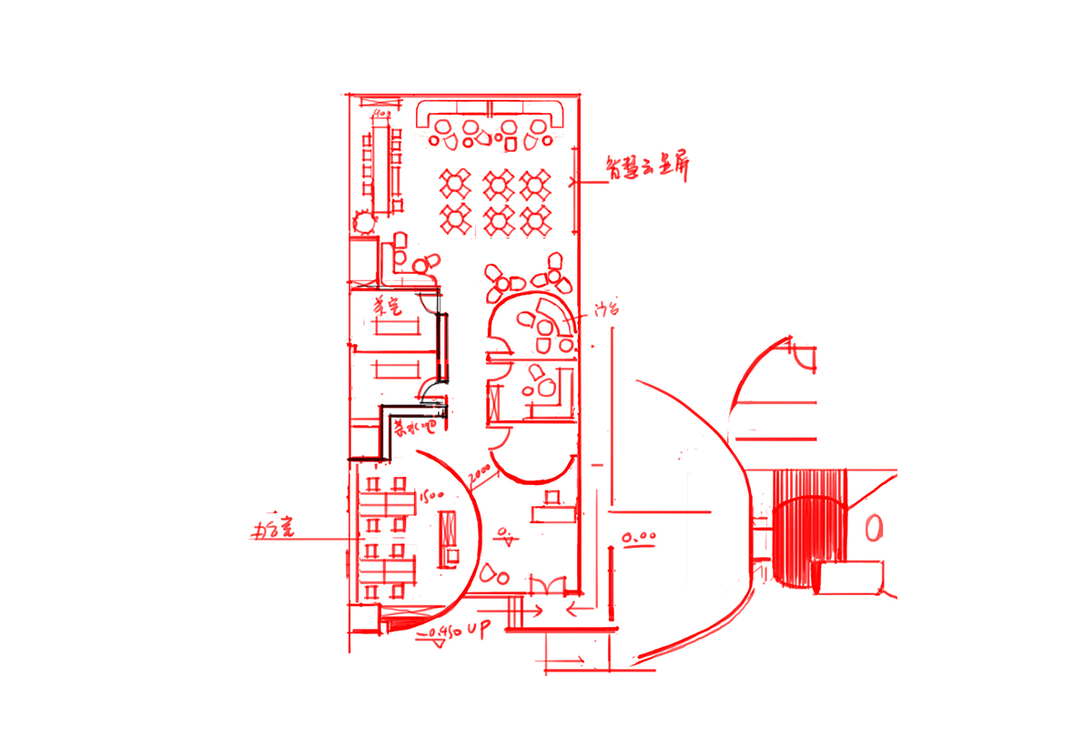
The "C" shape in CITIC Group's logo resembles a window and a key, symbolizing its mission as a gateway to China's reform and opening-up. Taking CITIC Bank in Shenzhen as an example, this project aims to reshape the traditional image of banking. The design employs U-shaped glass to construct two reversed "C"-shaped walls, which not only echo the corporate identity but also subtly delineate the functional zones of the private banking area. The largest "C"-shaped wall effectively alleviates the cramped feeling between the elevator and the lobby, easing the welcoming rhythm while guiding clients naturally along the curved path into the interior space. The softly glowing U-shaped glass contrasts with the dark wood finishes, and together with integrated lighting structures, uses architectural language to craft a contemporary banking image that balances functionality with symbolic meaning.